Saturday, December 04, 2010

Raindrops - progress pics!

"do you think the raindrops miss the sky?"

rd8

I really, really love drawing with Sharpies, and I really love Photoshop, but I usually just use one or the other. Most of my Sharpie doodles I've left as they are, besides adjusting colors, while pencil and ink drawings tend to be the ones that I really work on and make all painterly. But this time I did both!

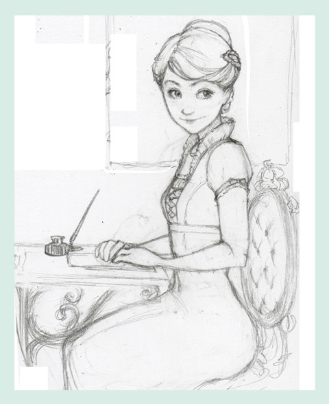
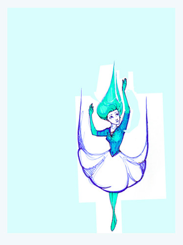
Here's the Sharpie scribble straight off the scanner:
rd1
I wasn't intending this to be a finishable piece, just a concept scribble, so I decided to give it lots of love to help it reach its full potential.

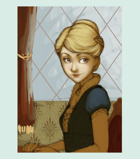
The scanner messed up the colors pretty badly, so the first thing I did was to fix them by creating adjustment layers for hue/saturation and curves. Adjustment layers are way better than just adjusting the image itself, because you can go back in, tweak the effects, and scale them back a bit until you're happy with it. Then you just merge them down onto the image!

I also started thinking about composition right off the bat for this piece. Then I brutally chopped off her left arm and reattached it, and gave her a haircut on one side to make room for the new pasted-on arm.
rd3

I roughly painted over the holes in her body and hair, set her layer to Multiply, and put an off-white layer under her to separate her from the background. I worked on the composition alongside the figure. I put in the gradients and textures very early in the process, but I turned off their visibility whenever I was working on the layers underneath, to keep the colors consistent. If you've ever tried to paint on a layer underneath another one, especially one that's on Multiply or something, you'll know you can just forget about the eyedropper.
rd5

Time to paint! I put a new layer on top of the lines, basic shading, and flat white to paint on, so everything would be nice and blended.
rd6
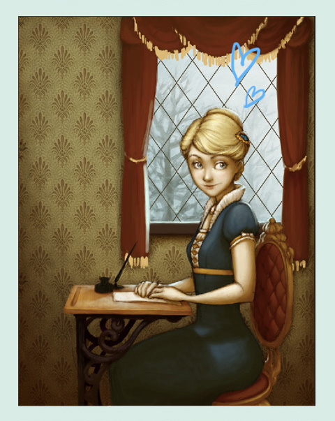
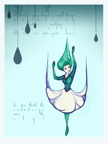
Obviously I tried some different things with the shape of her skirt and the streams coming off her hands, which I really liked, but eventually took off because they just didn't work. Also I'd adjusted the colors on the background and gradients at this point, because the textures I'd put on that aren't currently visible made the image a little too bright and I wanted to counteract that.

rd7
Looks almost done, right? HA!!!
At this point I realized a couple things:
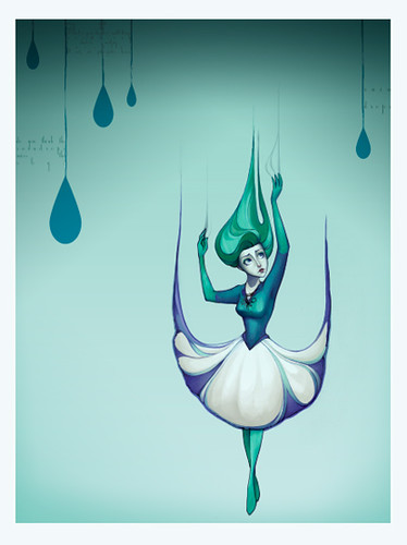
1. Her bottom half was really puny in proportion to the rest of her body.
2. I'd figured out the aspect ratio wrong, and the above images were a weird shape somewhere between 8x10 and 8x12.
I fixed both of those, and then I fixed the shape of her skirt to be nice and round and raindroppy - this was when I was reminded of how much I love the Liquify filter. It's good times.

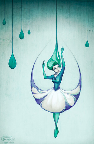
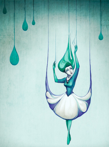
After all the shapes looked how I wanted them to, I created another painting layer to add the little details on her neckline and sleeves and face, and just to clean up all the rough spots. And then, THEN I was done.
rd8
Lessons learned:
1. Plan composition from the beginning, don't try to create one around a finished figure.
2. Seriously, liquifying is way fun.
3. Double check your aspect ratio!!!

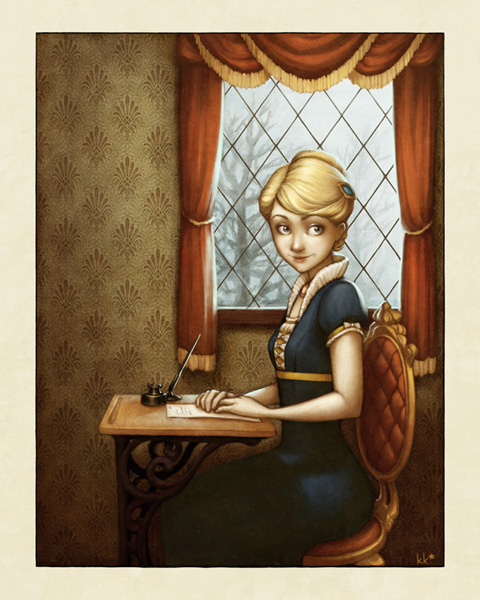
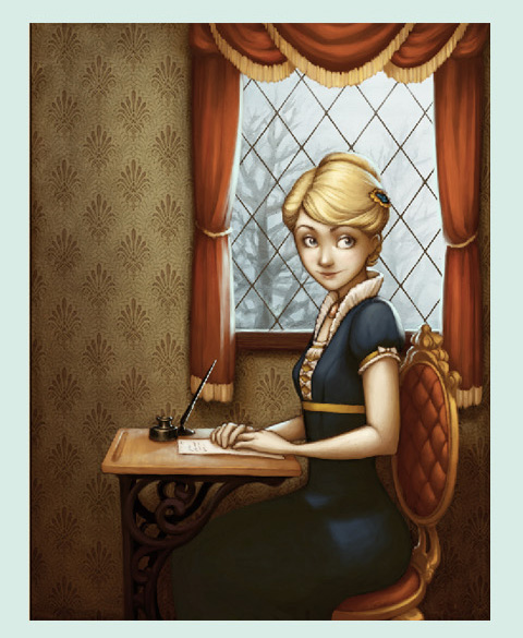
I've got prints of this for sale now in my Etsy shop!

Emjoy :D

Tuesday, November 16, 2010

more animation homeworks!

This assignment was to create a cycle with 4 elements... I thought the gears were the easiest part, but everyone was the most impressed by them, so that is probably an important lesson for life or something.


And here we have The Sneeze. I wasn't quite happy with the way this turned out. I really love the keys, especially on the sneeze itself, but it needs a lot more in-betweens at the beginning and end.


We're also spending the whole year in this class creating a complete short film. I'm VERY excited about this!!! I'm working on a story that I love, love, love. We've done our storyboards so far. Now onto the fun stuff!!!

Thursday, November 11, 2010

Autumn in the Park - process

Well, when I was working on this thing I thought I took a lot more screenshots of the process, but here's what I have. It doesn't properly show how many times I redid those effing trees!!!

parkprocess1
parkprocess2
parkprocess3
parkprocess4
parkprocess5

A couple notes:
-This one's all digital.

-I've always seen people using this technique on ConceptArt and stuff, of painting in black and white first to make sure you have a strong sense of value, but I always thought it was kind of overkill. However in school this year I'm really having COMPOSITION pounded into my head with a hammer, so I thought I'd give it a try.
It was fairly helpful, I think. It definitely made me use stronger contrast, which I tend to shy away from. The thing I really liked about it, though, was how when I added the color on top, it didn't exactly match up with the black and white underneath, which spawned some reeeally nice variations in saturation and color.

-I used separate layers when positioning the trees and buildings, but after I had that worked out, I flattened the image and only used new layers to paint over the whole image, flattening every now and then as I went along.

-I'm really getting to like experimenting with brush settings in Photoshop! I included a screenshot of the thumbnail of the brush I used for the whole piece once I got everything put together. It lends a nice thick smeary quality, don't you think??

-I used a couple textures from cgtextures.com and from my personal collection.

Enjoy!

Friday, October 15, 2010

i spend a lot of time googling myself

I just Google Image Searched myself. And I don't know if they've improved the search since they changed the layout, or if I just looked harder this time, or if I'm just more popular now, but I found out I'm all OVER the internet. I found my art on blogs and in galleries in Chinese and in Russian.

It's a little overwhelming and I'm not sure how to feel about it. I'm pretty new at this whole people-actually-look-at-my-art thing. Nobody's selling my art or anything, and the few sites that didn't have a link to my DA or Etsy still used my name, so it would be pretty easy for someone to find one of my official websites if they wanted to. So I'm not really scandalized by these people sharing my art without my permission - after all, they're just sharing. I'm mostly flattered. It just freaks me out a little that the sharing of my artwork is outside of my control.

I feel like I need to take a deep breath and set my art free into the world... but just start putting my full name and website on every image, keep as careful of an eye on it as I can, and kick the ass of anyone trying to make any money off it.

I'd like the thoughts of my fellow online artists, particularly those who have been popular for a while - what do you do about this??!?

Monday, October 04, 2010

back to school!

Well hello there!

I figured it's a new school year and a great time for a new start at blogging.

This is what I've done so far my 2nd year:


ta-da!!!

Monday, February 22, 2010

writing letters - process images!

Look! I drew something new.

writinglettersblog

Dearest Mama,
 I hope that this letter finds you & everyone at home very well. Cynthia & I have been having the loveliest time here at Aunt Violet's - despite all our protestations she took us into town earlier to-day to shop & I purchased the sweetest pair of cream-colored gloves. I think they shall go with my plum-colored walking-dress very charmingly!
 Cynthia of course nearly filled up the carriage with all the ribbons, gloves, hairpins, shoes, &c. that she simply had to have!
 Aunt Violet wishes to be remembered to you & sends her love. I look forward to being home again, and to seeing you & Father. Until then, I shall be
 Your loving Daughter,
 Georgina

This came out of my recent reading of Jonathan Strange and Mr. Norrell by Susanna Clarke, which is a really wonderful clever absorbing Austenesque fantasy about two magicians trying to restore English magic, which is in a sorry state, to its former glory. I might have to do an edition of THE BEST BOOKS EVER on it soon.

The whole time I was reading it all I wanted to draw was a nice Empire-waisted gown, and eventually a sketchbook doodle turned into this. I actually took a couple of screenshots in progress of this one, so I thought I could share them here!

These images are not really a clear step-by-step representation of the entire process, because I wasn't planning all along on putting them all together. If it seems like people are really interested, I can screenshot the different steps more clearly on my next project!

Here we go:
lettersprogress
Step One: Pencil sketch. I hardly ever start out on the computer, because I love the grit and smudges you get from a real pencil or pen.

This is approximately my thought process when drawing something like this: "Hmm... I have no idea what this professor is talking about. Oh, here's some space at the side of the page. Let's think about my next drawing... I think the hair should look something like this... and eyes like this - oh hey, that looks cool. She kind of looks like she's sitting for a portrait. Let's go with that. Hmm, hmmm... doot de doo..."

lettersprogress2
Steps Two thru Two Point Five: Flat colors, background scribbles, beginning shading. This is the part that's like a coloring book. I thought coloring books were really boring as a kid. I still think this step is really boring.

The notable part of this image is step 2.5. Usually I do the obvious thing, which is to just color your shading as you go, but this time I did the reverse, which was to create a whole dark layer - usually set on Multiply or the like - and then erase the parts that should be brighter. If you use a layer mask for the job, it makes it beautifully easy to change the shadow colors in different areas.

Sorry this one's so cropped, I made it to show on Twitter as, like, a teaser. Lame.

lettersprogress3
Steps Three thru Four-ishhh: Ignore the hearts. Um. Finished the shading, started adding highlights on another layer, did the scene outside the window, cleaned up the drapes a bit so I could shade them properly.

lettersprogress4
Steps Five and Six: After finishing up the shading and whatnot, I started playing around with the color to see if I could get it to look better. A lot of times I stare at a picture for so long I don't realize the color is leaning precariously in one direction. At this point, I figured out that the whole image was looking awfully green and a little dull, so I fixed things up with a Selective Color layer.

After I get all the colors looking the way I want to - or sometimes before, it varies - I create a new layer to paint on and blend everything together. This is super fun because you get to smoosh colors around and stop worrying about keeping things on layers! Keeping layers separate is helpful when you're working on the "structure" of a piece, but if you keep it that way, it never looks quite as coherent as it could. This is when I fill in all the details, smooth everything out, and blend the lineart into everything. I also made changes like working on her expression very slightly, so she looked less sultry and more like my original drawing.

Step Seven-ish: Textures! You can see the result of these in the final piece at the very top. I use textures from sites like this and paste them in, then set them to a low opacity and whatever blending mode looks best. Using a few different textures, and using them subtly, looks a lot better than having an identifiable concrete wall smacked over your artwork, which is totally what I used to do. A texture can also affect the colors of the piece, and by playing around with its brightness, contrast, hue and saturation, you can control this effect.

Ta-da!!! Nothing to it, right? But seriously, folks, I spent years flailing around in Photoshop before I figured out there was a better way to do most things. I hope maybe I can help somebody else start flailing in the right direction!

I've used a LOT of jargon here, I know, so if there's stuff I said that makes no sense, ask and I will clarify! Like I said, maybe next time I'll show each step more clearly, and I can get more in-depth about the Photoshop stuff I'm talking about too!

Whew!!!

Tuesday, February 02, 2010

a good day!

1. Up is nominated for Best Picture! Now Princess and the Frog can win Best Animated and I will be completely satisfied.

2. My print was on the front page of Etsy this morning! I've had stuff on the FP before, but I dunno if I've ever had a response like this. The amount of new shop hearts I have is absurd. And the item sold too! That doesn't always happen! :)

3. LOOOOOOOSSSST

Friday, January 29, 2010

we've come a long way, baby

This is a meme that's been making the rounds on deviantART and I had to give it a try because I love seeing how my art has improved!

The concept is simple: pick four artworks from each of the past seven years to represent where your art was during that year, and write a little description about where you were in your life.

Here's my list:


If you can't read that, for which I don't blame you at all, just click on the image! It'll take you to the page on DA, then all you have to do is click on the small image there to see it full size!

Thursday, January 21, 2010

best books ever: the book of flying


This, along with several other works-in-progress I'll hopefully be posting soon, was directly inspired by my rereading of one of my very, very favorite books of all time. And guess what! I'm going to tell you all about it, in this first installment of THE BEST BOOKS EVER!!!

Volume 1: The Book of Flying, by Keith Miller.

This book is possibly the closest thing to a perfect story I have ever read. This book helps you understand what real magic is. This book makes me have to draw, because this book is brimming with paintings turned into words.

The story is about a lonely librarian named Pico who lives in a city by the sea where nobody knows how to read. He falls in love with a winged girl who can never be with someone who can't fly, so his sets off on a quest to find the mythical "morning town" of Paunpuam and gain his own pair of wings. Pico's journey is episodic; he travels through deep forest, over mountains, and across a desert. As he meets each new character, they tell him their own story, and then move out of the tale as he journeys onward and eastward. One review called it "a book about books, a story about stories," which I think is charming and accurate.

The writing is like poetry, full of images and metaphors. It's flowery, but not in a pretentious way, just for the sheer love of words. For someone who loves books and adventures and magic as much as Pico does - namely, myself - it's everything I wish I could express in my art.

My very favorite part of the story, the part that has inspired all these doodles I'm working on, is the city in the mountains where Pico rests for a few months and nearly gives up his quest altogether. I don't blame him. In this nameless city that's kind of a rainy cobblestoned Bohemian Paris-London mashup (in my mind, at least):
1. It rains all the time, and
2. Everybody reads all the time.
So of course... I would be very happy living there.

"A city of squalls, foggy mornings, intervals of blue and white so immaculate the eyes ached. A city of readers, coffee drinkers, kissers on sidewalks, sad faces at wet windows. A city of umbrellas, woolen scarves, raincoats, cigarettes, wineglasses, cognac."

swoon.

READ THIS BOOK!!!!!

*My most recent Etsy treasury matches this theme and artwork very well, although the correlation wasn't intentional.

Wednesday, January 13, 2010

haiti earthquake relief

Hey everyone,

I'm going to keep this short, because I don't want it to get sappy, but I just wanted to let you know I decided to donate all the profits I make from both my Etsy shops for the rest of the month of January to UNICEF to help their relief effort in Haiti.

Basically, I don't have any money to donate myself at the moment, so the way I'm thinking of it is if I can get some other people to help out, I can at least send those people some pretty jewelry or prints as a thank you.

If you want to help out on your own, here's a good list of organizations that you can donate to.

Thank you, and I hope you find your own way to give!!!

My shops:
Prints
Jewelry

Tuesday, January 12, 2010

new semester, new shop, new shoes

Back to school! Today was my second day of classes. Most of my classes are the same, but I did have one new one today - History of Typography! Yeah, it fills an art history requirement, but I would have wanted to take this class anyway. I looove type and fonts and all that - it's sort of an interesting connection between my artistic side and my passion for linguistics. (Not being sarcastic. Fun fact: I almost went to school for linguistics instead of art!)

Along with getting back to studying, I'm spending a lot of time creating jewelry for my new Etsy shop! I just started listing stuff on Sunday and already sold something, which sure beats the weeks I waited in agony for my first Etsy sale the first time around! Boy, have I learned a lot since then... mostly how to make things that people will want to buy, and just as importantly, how to take decent pictures of them.

As a grand opening celebration, I'm offering FREE SHIPPING on everything from now through January 20. Dude. Did you get that? FREE SHIPPING. That is pretty awesome.

One more link to my shop: The Spaces in Between

Keep an eye on it, cause the best stuff is still being listed!!!

Oh yeah... mostly I wanted a nicely rounded title, but I did get some pretty sweet new shoes over break. I treated myself with my Christmas money from Grandma to a pair of gray Blowfish hobbit boots.


I didn't own a single pair of boots except for rain ones, and I've learned that in NYC in the winter, bootless is a very silly state to be in. The situation is now remedied.