
A couple notes:
-This one's all digital.
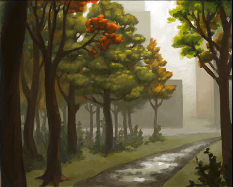
-I've always seen people using this technique on ConceptArt and stuff, of painting in black and white first to make sure you have a strong sense of value, but I always thought it was kind of overkill. However in school this year I'm really having COMPOSITION pounded into my head with a hammer, so I thought I'd give it a try.
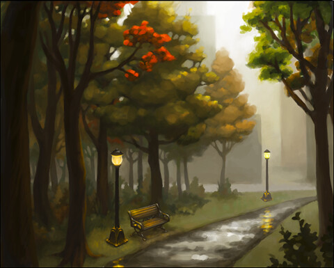
It was fairly helpful, I think. It definitely made me use stronger contrast, which I tend to shy away from. The thing I really liked about it, though, was how when I added the color on top, it didn't exactly match up with the black and white underneath, which spawned some reeeally nice variations in saturation and color.
-I used separate layers when positioning the trees and buildings, but after I had that worked out, I flattened the image and only used new layers to paint over the whole image, flattening every now and then as I went along.
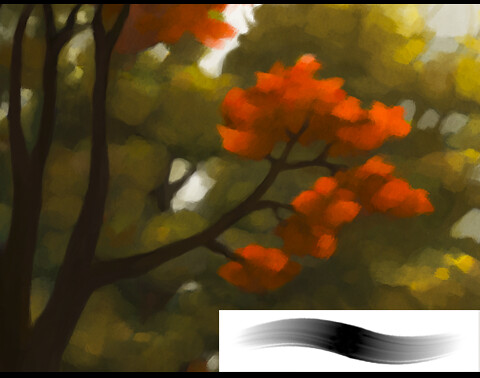
-I'm really getting to like experimenting with brush settings in Photoshop! I included a screenshot of the thumbnail of the brush I used for the whole piece once I got everything put together. It lends a nice thick smeary quality, don't you think??
-I used a couple textures from cgtextures.com and from my personal collection.
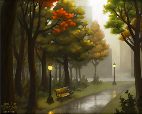
Enjoy!

No comments:
Post a Comment