This assignment was to create a cycle with 4 elements... I thought the gears were the easiest part, but everyone was the most impressed by them, so that is probably an important lesson for life or something.
And here we have The Sneeze. I wasn't quite happy with the way this turned out. I really love the keys, especially on the sneeze itself, but it needs a lot more in-betweens at the beginning and end.
We're also spending the whole year in this class creating a complete short film. I'm VERY excited about this!!! I'm working on a story that I love, love, love. We've done our storyboards so far. Now onto the fun stuff!!!
Tuesday, November 16, 2010
Thursday, November 11, 2010
Autumn in the Park - process
Well, when I was working on this thing I thought I took a lot more screenshots of the process, but here's what I have. It doesn't properly show how many times I redid those effing trees!!!

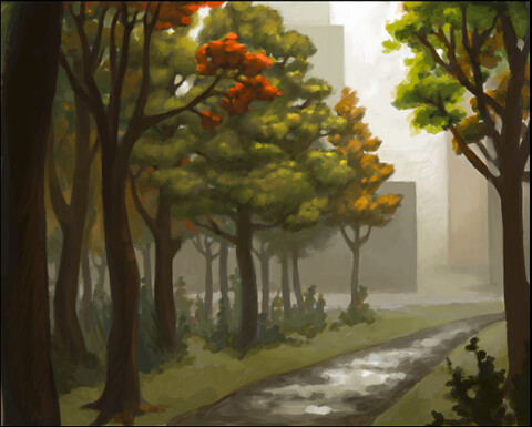
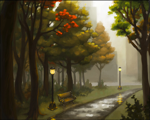
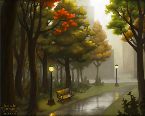
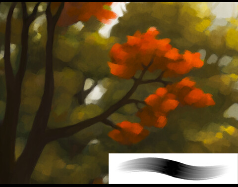
A couple notes:
-This one's all digital.
-I've always seen people using this technique on ConceptArt and stuff, of painting in black and white first to make sure you have a strong sense of value, but I always thought it was kind of overkill. However in school this year I'm really having COMPOSITION pounded into my head with a hammer, so I thought I'd give it a try.
It was fairly helpful, I think. It definitely made me use stronger contrast, which I tend to shy away from. The thing I really liked about it, though, was how when I added the color on top, it didn't exactly match up with the black and white underneath, which spawned some reeeally nice variations in saturation and color.
-I used separate layers when positioning the trees and buildings, but after I had that worked out, I flattened the image and only used new layers to paint over the whole image, flattening every now and then as I went along.
-I'm really getting to like experimenting with brush settings in Photoshop! I included a screenshot of the thumbnail of the brush I used for the whole piece once I got everything put together. It lends a nice thick smeary quality, don't you think??
-I used a couple textures from cgtextures.com and from my personal collection.
Enjoy!
Subscribe to:
Comments (Atom)
