Dearest Mama,
I hope that this letter finds you & everyone at home very well. Cynthia & I have been having the loveliest time here at Aunt Violet's - despite all our protestations she took us into town earlier to-day to shop & I purchased the sweetest pair of cream-colored gloves. I think they shall go with my plum-colored walking-dress very charmingly!
Cynthia of course nearly filled up the carriage with all the ribbons, gloves, hairpins, shoes, &c. that she simply had to have!
Aunt Violet wishes to be remembered to you & sends her love. I look forward to being home again, and to seeing you & Father. Until then, I shall be
Your loving Daughter,
Georgina
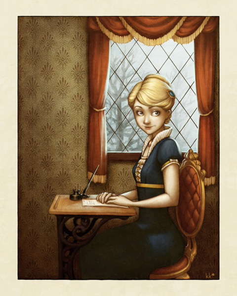
This came out of my recent reading of Jonathan Strange and Mr. Norrell by Susanna Clarke, which is a really wonderful clever absorbing Austenesque fantasy about two magicians trying to restore English magic, which is in a sorry state, to its former glory. I might have to do an edition of THE BEST BOOKS EVER on it soon.
The whole time I was reading it all I wanted to draw was a nice Empire-waisted gown, and eventually a sketchbook doodle turned into this. I actually took a couple of screenshots in progress of this one, so I thought I could share them here!
These images are not really a clear step-by-step representation of the entire process, because I wasn't planning all along on putting them all together. If it seems like people are really interested, I can screenshot the different steps more clearly on my next project!
Here we go:
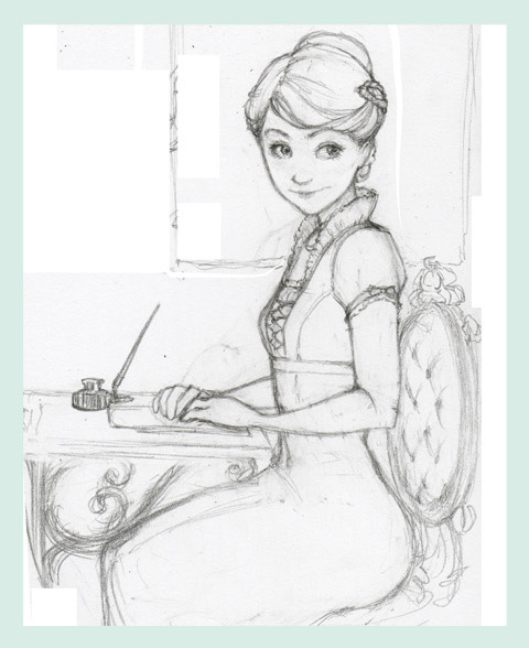
Step One: Pencil sketch. I hardly ever start out on the computer, because I love the grit and smudges you get from a real pencil or pen.
This is approximately my thought process when drawing something like this: "Hmm... I have no idea what this professor is talking about. Oh, here's some space at the side of the page. Let's think about my next drawing... I think the hair should look something like this... and eyes like this - oh hey, that looks cool. She kind of looks like she's sitting for a portrait. Let's go with that. Hmm, hmmm... doot de doo..."
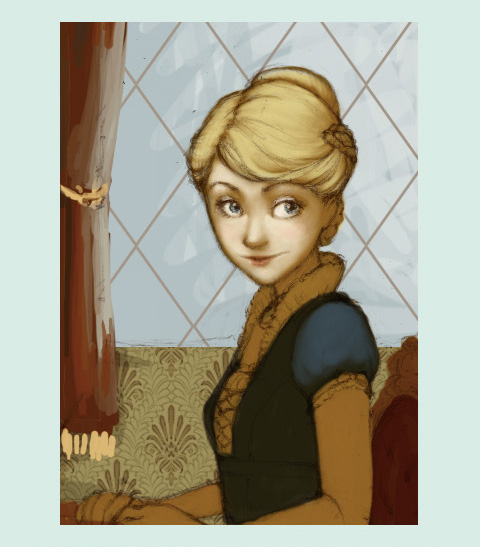
Steps Two thru Two Point Five: Flat colors, background scribbles, beginning shading. This is the part that's like a coloring book. I thought coloring books were really boring as a kid. I still think this step is really boring.
The notable part of this image is step 2.5. Usually I do the obvious thing, which is to just color your shading as you go, but this time I did the reverse, which was to create a whole dark layer - usually set on Multiply or the like - and then erase the parts that should be brighter. If you use a layer mask for the job, it makes it beautifully easy to change the shadow colors in different areas.
Sorry this one's so cropped, I made it to show on Twitter as, like, a teaser. Lame.
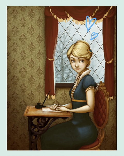
Steps Three thru Four-ishhh: Ignore the hearts. Um. Finished the shading, started adding highlights on another layer, did the scene outside the window, cleaned up the drapes a bit so I could shade them properly.
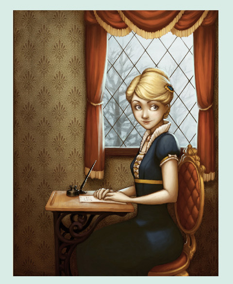
Steps Five and Six: After finishing up the shading and whatnot, I started playing around with the color to see if I could get it to look better. A lot of times I stare at a picture for so long I don't realize the color is leaning precariously in one direction. At this point, I figured out that the whole image was looking awfully green and a little dull, so I fixed things up with a Selective Color layer.
After I get all the colors looking the way I want to - or sometimes before, it varies - I create a new layer to paint on and blend everything together. This is super fun because you get to smoosh colors around and stop worrying about keeping things on layers! Keeping layers separate is helpful when you're working on the "structure" of a piece, but if you keep it that way, it never looks quite as coherent as it could. This is when I fill in all the details, smooth everything out, and blend the lineart into everything. I also made changes like working on her expression very slightly, so she looked less sultry and more like my original drawing.
Step Seven-ish: Textures! You can see the result of these in the final piece at the very top. I use textures from sites like this and paste them in, then set them to a low opacity and whatever blending mode looks best. Using a few different textures, and using them subtly, looks a lot better than having an identifiable concrete wall smacked over your artwork, which is totally what I used to do. A texture can also affect the colors of the piece, and by playing around with its brightness, contrast, hue and saturation, you can control this effect.
Ta-da!!! Nothing to it, right? But seriously, folks, I spent years flailing around in Photoshop before I figured out there was a better way to do most things. I hope maybe I can help somebody else start flailing in the right direction!
I've used a LOT of jargon here, I know, so if there's stuff I said that makes no sense, ask and I will clarify! Like I said, maybe next time I'll show each step more clearly, and I can get more in-depth about the Photoshop stuff I'm talking about too!
Whew!!!

4 comments:
This is fantastic...thanks for sharing so much of your technique...I don't have photoshop :( have just been trying to learn a few things in Gimp.
I am so impressed with this picture. . .Thank you for the step by step, I am just amazed. I used to play around with Paint Shop but photoshop was so much more advanced.
Hey! Do you think you could explain what layer masks are? 9______6
This is simply -- AMAZING!
Post a Comment